Branding the Art of Flower Pressing for Men
Brief: Unearth a long-forgotten past-time but make it relevant for today.
2022 | University Brief (set by Born Ugly)
Problem: There is a stigma men can’t enjoy flowers in the same way women can. People are also buying more flowers than ever with delivery and subscription services. Flower gifting may not feel as special. Buying flowers is also bad for the environment and flower pressing allows you to reuse old flowers.

Solution: Brand flower pressing for men aged 22-30 by leaning into the ritualistic and tactile nature of flower pressing. Think old style shaving brushes, blades and creams, rolled cigarettes and film cameras. Pull from influences of tradition, loyalty and timelessness. With nods to Victorian-era design style and the Peaky Blinders.

The final logo is a modified version of the google font Fondamento. The ‘e and m’ and the ‘m and I’ we connected by hand and the & symbol is designed uniquely for the type. It brings through elements of the traditional Victorian era while remaining modern and versatile to use across platforms. The lowercase was chosen as its less formal and more welcoming design.

The three symbols represent the core values of the brand and who the brand is for. Inspired by signet rings and family crests. These are used across the brand deliverables, they are recognisable badges of honour. The brand colours were inspired by the colours of old documents found in the visual research. They have a natural but strong look and work well together and alongside black and white. Textures are used throughout the outcomes to add an element of tactile. The ‘&’ icon would be used in places where the full logo isn’t possible as it can be more legible at smaller scales. It was important to have the icon nod to the name in some context.


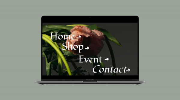
The website is the focal point of the brand, it’s largely an informational tool to represent who the brand is and what they do. There are three core pages: The home is a long scroll page to introduce the brand and set the scene. The shop is primarily to feature the flower press, with additional spare parts taken into account such as screws, paper and cards. The shop also features other hand-printed items. Then the event page links directly from the initial posters. The website is designed to encapsulate a movement rather than just sell a product.


The tote bag is also screen printed. It is photographed with flowers inside to hint at the brand. The three symbols are used here again to create
a recognisable image for the brand. The toe bag could be used to pick up flowers to press, to carry your flower press or for any other activity.


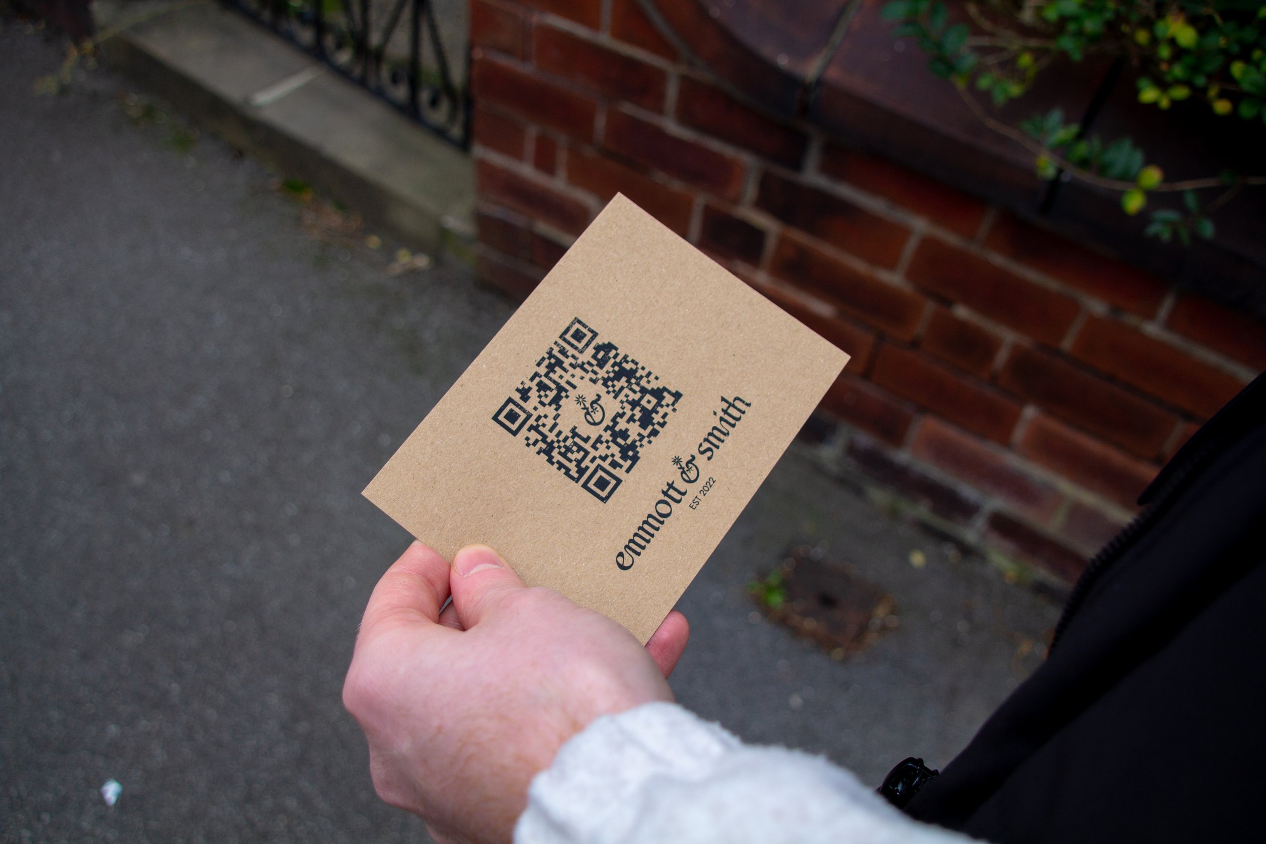
The designs are all handmade and screen-printed. They simply display three simples, the logo and a QR code. They intend to strike the curiosity of the target audience and the code would take them to the website where they could learn more about the brand and products.

The packaging was specifically shown to be brown paper to reflect the sustainable aspects of the brand. The core values, icons and logo. There is minimal design to not overpower the flower press design as it’s quite intricate. The flower press is hand-painted black with an ornate, victorian inspired design. There were no black flower presses that could be found during the visual research. It provides a more slick look and makes the flower press stand out from the rest. The flower press is designed to stand out from the rest of the branding and be a focal point.


Research
Below is just a small selection of some research pages from the project. Data was also analysed specifically search and trending topics. It was discovered there were occasional spikes in searches for men’s flowers and many searches from people searching for ways to make flowers last longer. I was decided that marking the product to men would be interesting and unique but challenging. It could reinvent the product while challenging traditional associations.


Development
Below are some development logo concepts. Some use more abstract shapes while others are more literal interpretations. There is a variety of hand-designs and digitally crafted logos. It was decided early on in the development that the letters were very important to include in the final logo as the family name aspect was vital to push across the brand.
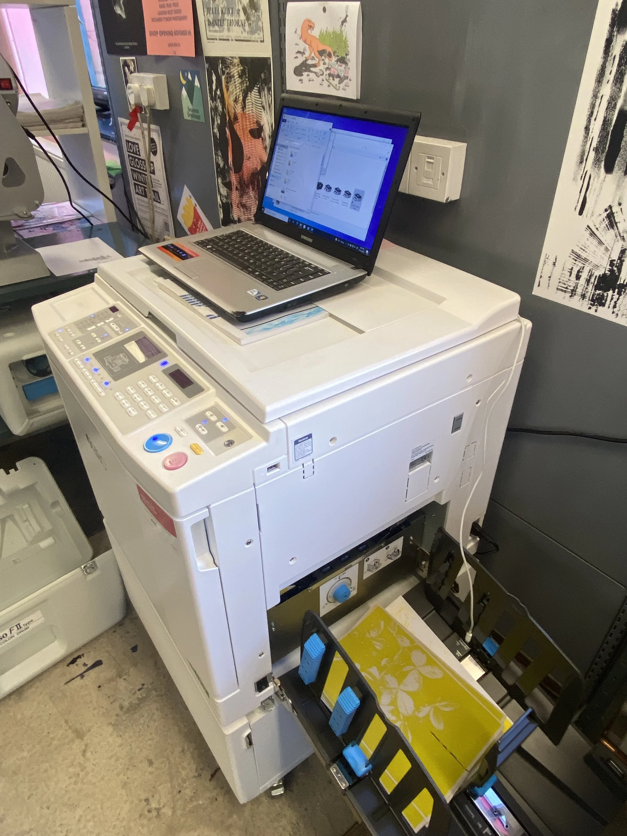
The USP of the Emmott and Smith flower pressing brand was bringing back the beauty of the creative physical process. In a world where we are consumed by technology during the pandemic, people craved the simplicity and mindfulness that arts and crafts provide. Throughout the development, many physical techniques were explored such as screen printing, risograph printing, calligraphy, actual flower pressing and painting were explored. A day was spent in a Kind-er Studio specifically printing outcomes.