

Disruption Festival
Brief: Create a coherent brand for a fictional experimental music and arts festival.
The festival is presented by Warp Records, featuring music performances from artists such as Aphex Twin and Battles. Performance styles are experimental and avant-garde, all representatives of cutting-edge alternative music.

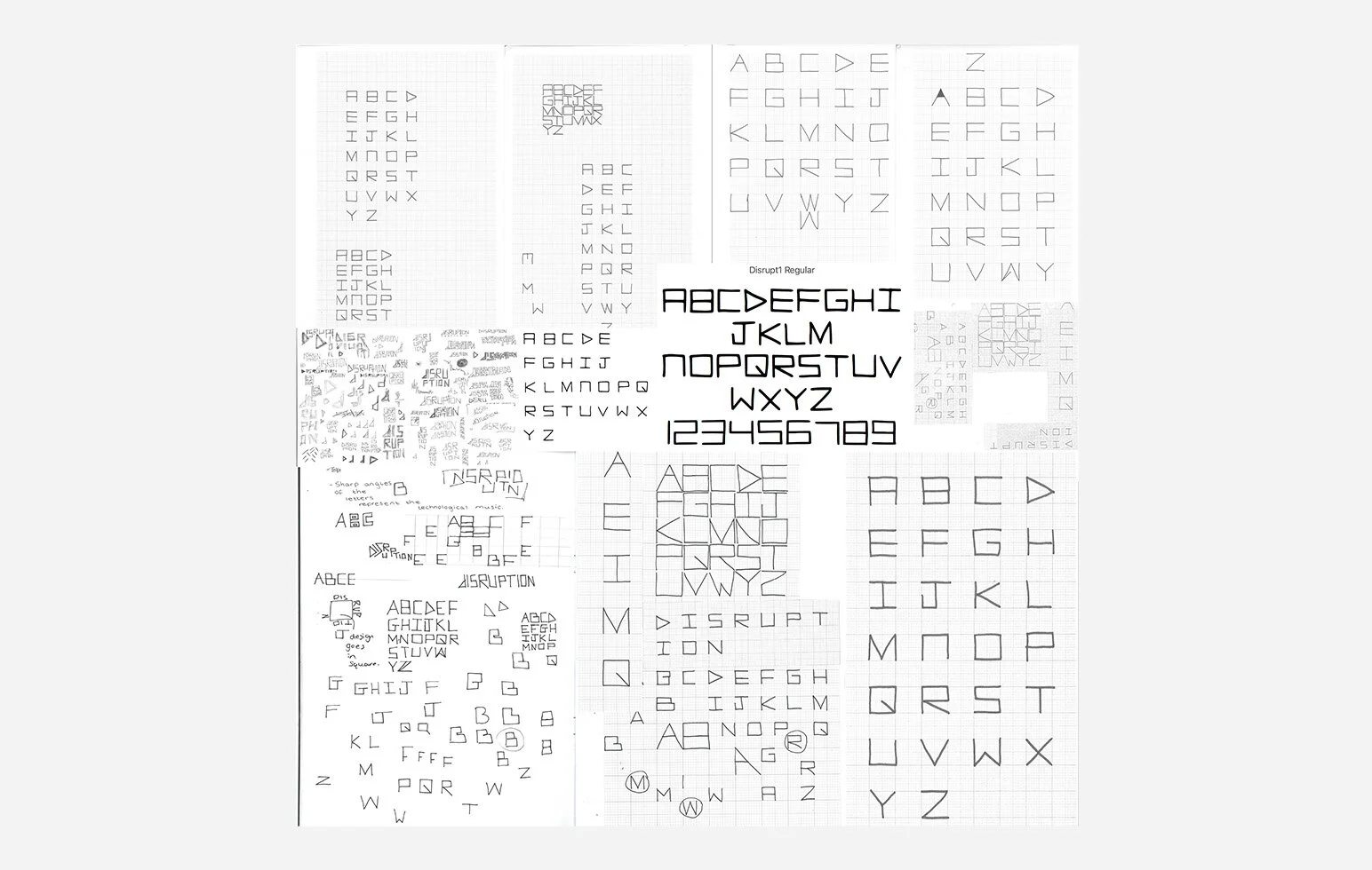
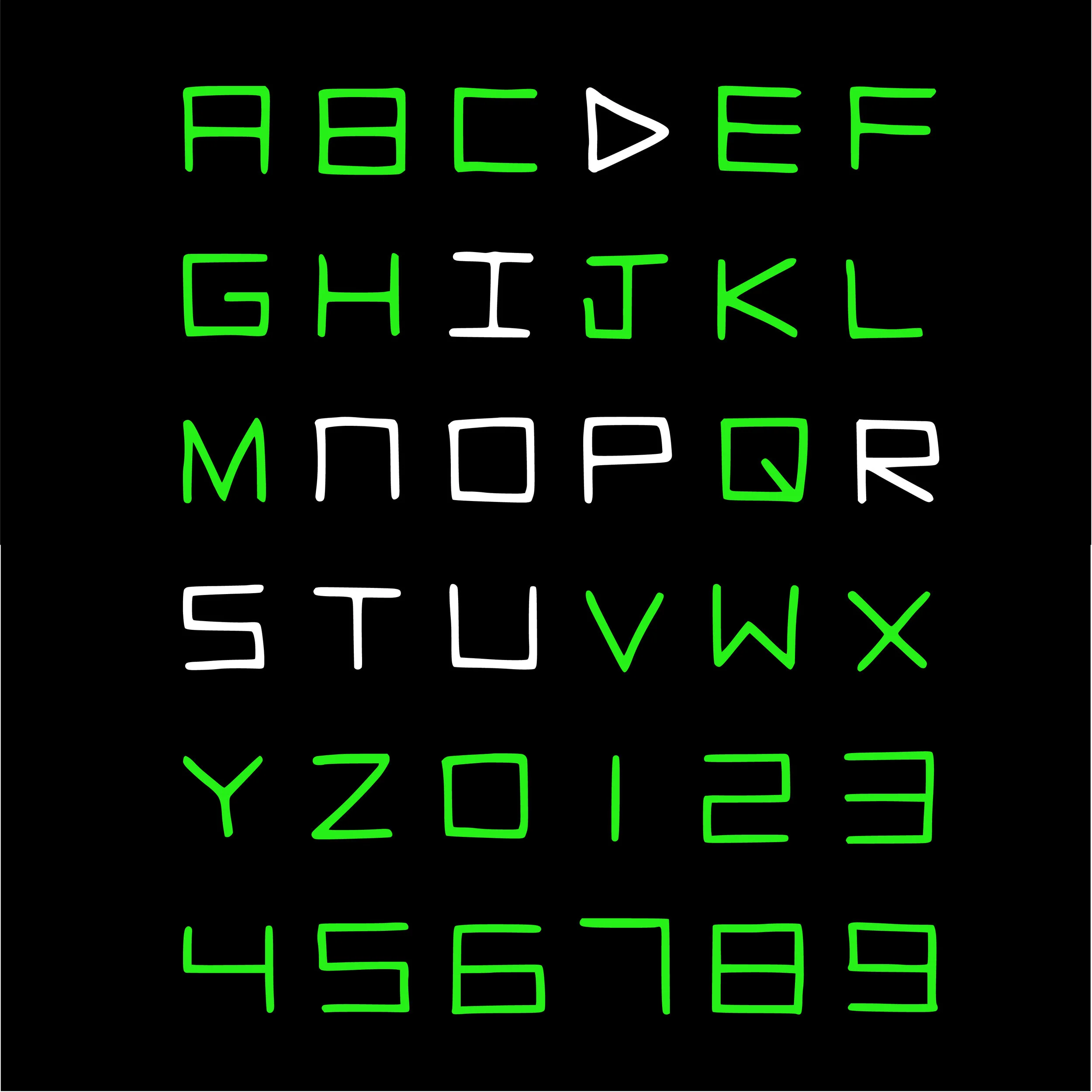
A logo needs to have the versatility of being repeated, drawn, scaled and placed in any way necessary. The final logo is made up of the letters of the word ‘disruption’ in the disrupt typeface that was created for the festival (see further down this page). Each letter is laid on top of each other, to form a unique square with a combination of lines inside. The logo is intended to be similar to a code that needs to be cracked and was heavily inspired by ‘the cool s’ a popular graffiti sign used in the 1980s - 2000s; the disruptive nature of graffiti fits well with the overall tone of voice.
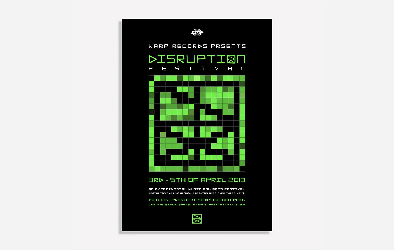

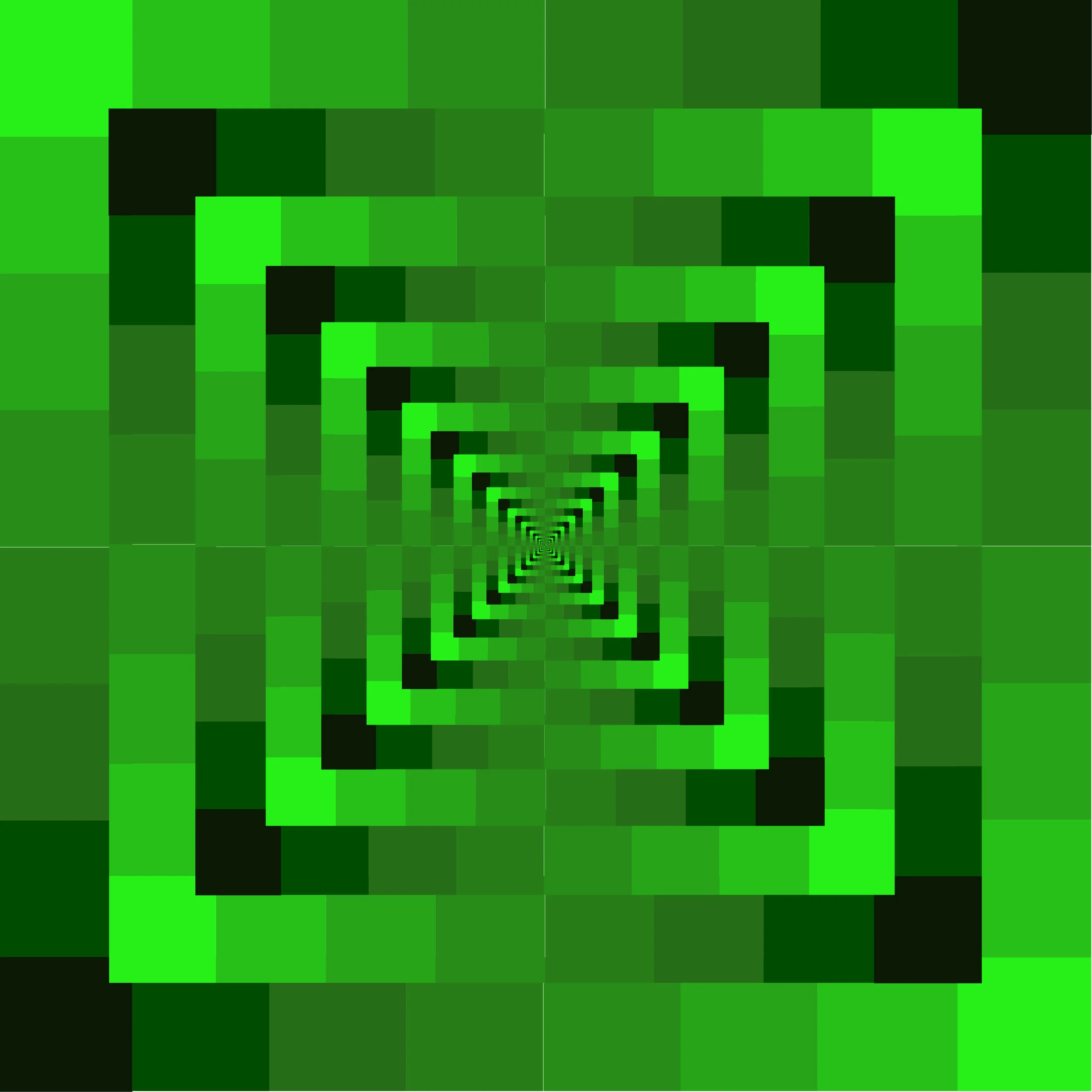
The final bus stop poster uses the gradients of colour from the green monochrome monitors. The poster displays a pixelated version of the logo made up of squares, inside a square; squares are a reoccurring aspect of the festival’s identity as they are the base of the typeface and logo. The combination of gradients adds depth and some movement to the flat design. The design links back to the research and idea of a code that needs cracking as the logo is not completely clear. The disrupt typeface is also used for the body text linking to the logo’s origin and making the disruption festival imagery work across formats.
Each moving image displays a type of disruption to the logo or typeface this disruption goes to the beat of different parts of the song Atlas by The Battles. Moving image one features the logo glitching or ghosting to the music. Moving image two runs through the alphabet highlighting the letters of disruption changing the opacity to the music; this design was intended to have a ‘word search’ like appearance. Finally moving image three displays the creation of the logo while scaling smaller and larger to the beat of the song. The moving images bring together the whole concept of music and glitching technology.


Research into existing festival logos and branding was conducted. Both Green Man Festival and V-Festival have a specific typeface used exclusively for the festival; this creates a unique and recognisable brand identity across a range of mediums. Reading and Leeds Festival use a colour palette that consists of yellow and red, demonstrating the capability and effectiveness of a simple colour palette. Research into Warp Records and the artists such as Aphex Twin, Battles and Children of Alice was carried out by listening to their music and understanding the imagery previously used to represent it. Due to the electronic nature of the music, technological imagery became a source of inspiration and began an exploration into the relationship between technology and electronic music. In particular, monochrome monitors from the 1980s became an essential point of influence.


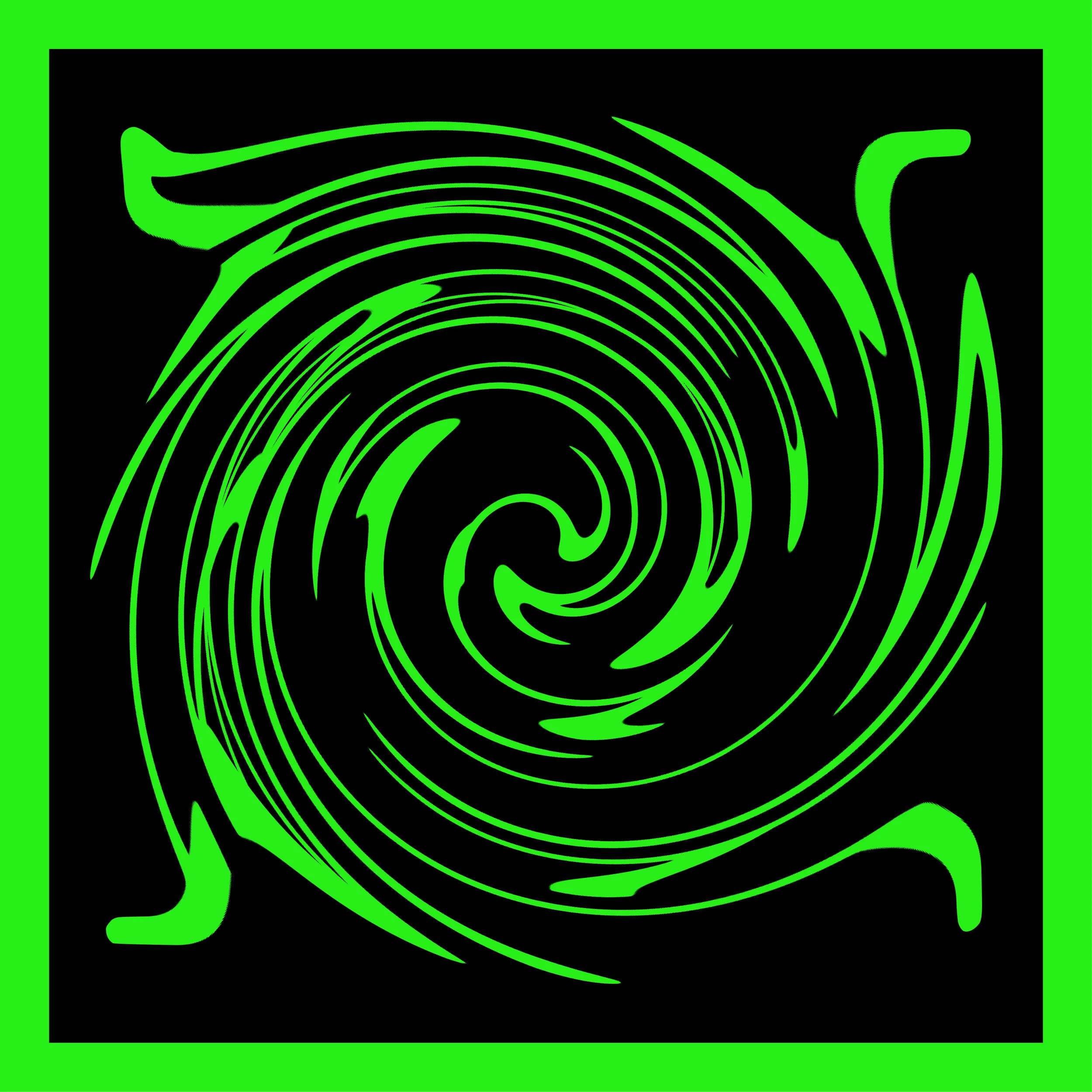


The multi-page document begins as a square envelope with a sticker of the logo holding it all together, once removed the paper folders out and has a small square booklet inside. Inside the booklet are lots of visual responses to the word disruption, including with word twisted on the front. There is also an optical illusion displaying the neon gradients, and a page of that includes a game template of dots and boxes. This game makes the piece more interactive for audiences and further links to ideas of solving a puzzle while also linking to the continuous repetition of square boxes.